Settle
Settle is a London-based charity that takes a preventative approach to homelessness, supporting young adults at the key transition of moving into their first home after leaving the care system.
For many young people moving out is a positive decision, taken when they feel ready to live on their own, with the help of their family. However for care leavers, this transition is often unsupported and abrupt.
62% of under 25s become homeless due to a relationship breakdown, usually with their parents. The absence of those relationships means young people living independently lose essential advice and emotional support.
62% of under 25s become homeless due to a relationship breakdown, usually with their parents. The absence of those relationships means young people living independently lose essential advice and emotional support.
Through intensive 1:1 coaching around wellbeing, financial literacy and employment, Settle helps young people create long lasting change and build a stable life.


Settle approached us to create a new brand identity that reflects their innovative approach to tackling homelessness.
Our brand strategy was guided by the idea of ‘Moving Forward’, reflecting Settle's mission of empowering young people and the transformational relationships they create.
A core principle of Settle’s work is to involve young people in everything they do from programme design to decision making.
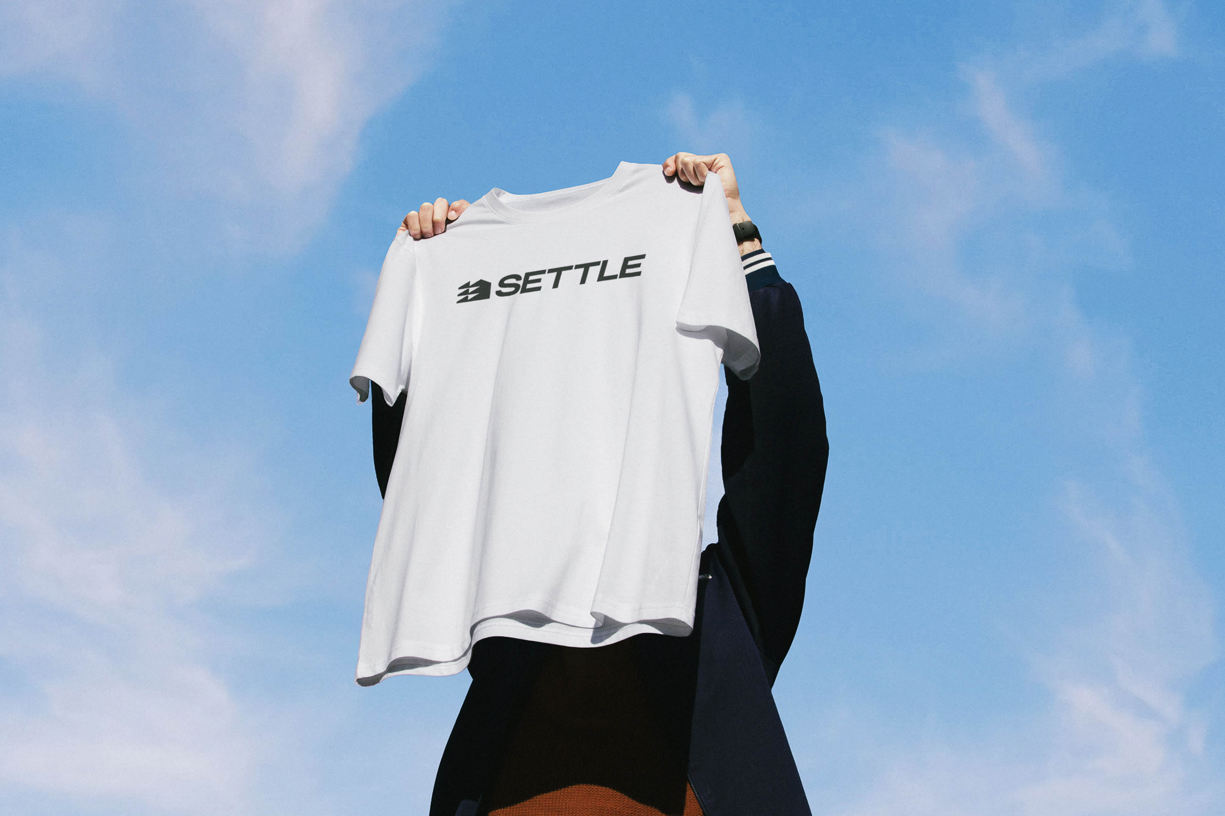
To reflect this approach, we drew inspiration from the world of streetwear to create a contemporary charity brand with young people at its core.
A core principle of Settle’s work is to involve young people in everything they do from programme design to decision making.
To reflect this approach, we drew inspiration from the world of streetwear to create a contemporary charity brand with young people at its core.
Our bold, robust symbol was informed by the blocky rooftops of London townhouses. The repetition of angular shapes conveys a sense of energy and positive direction.
We paired this symbol with an understated logotype that borrows from contemporary streetwear aesthetics, with the intentional use of bold italics to embody our ‘Moving Forward’ brand idea.
To further emulate the language of streetwear, we created a suite of logo variations to be used expressively across their brand communications.
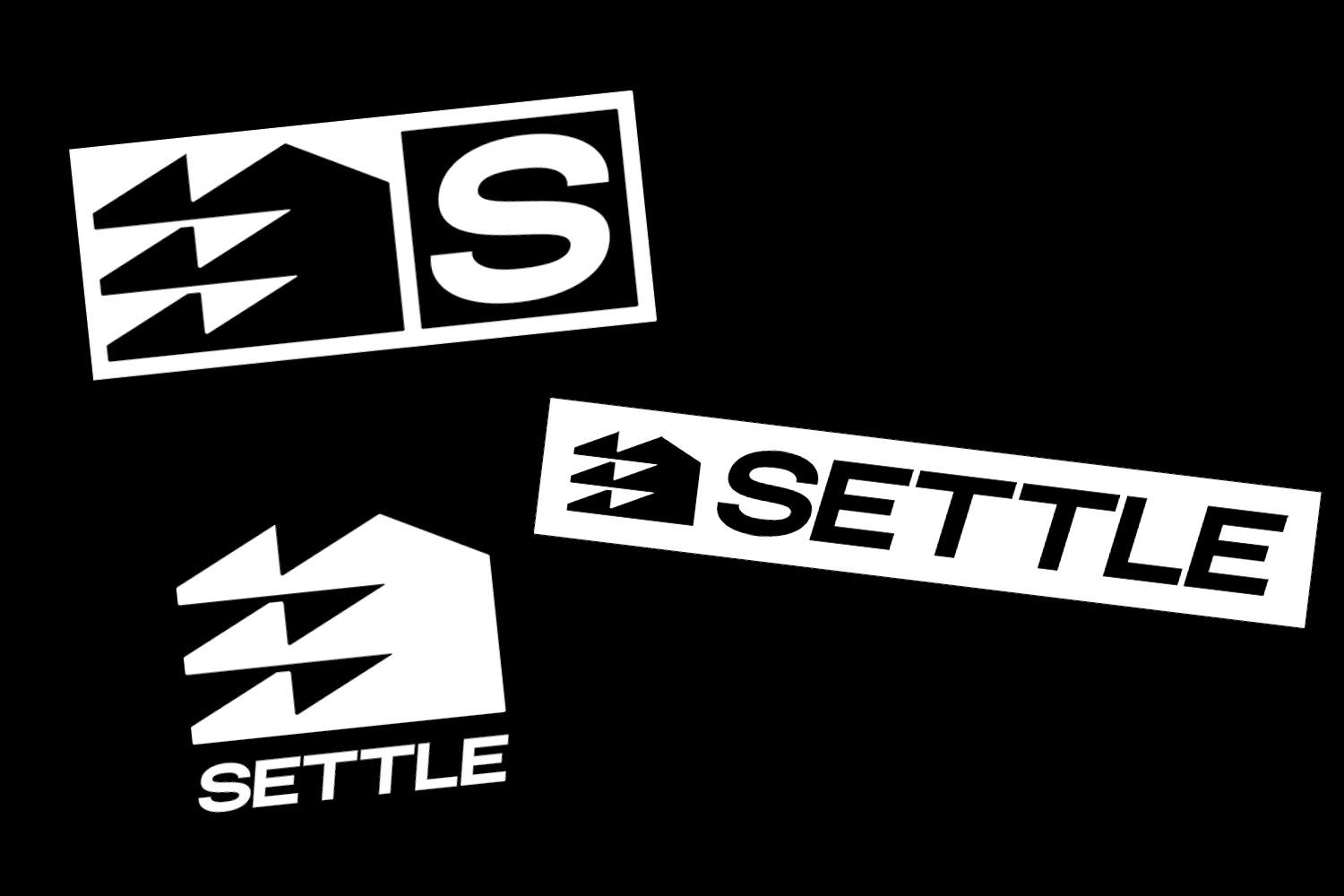
Settle’s visual identity taps into a lo-fi, street-press, youth culture design language.
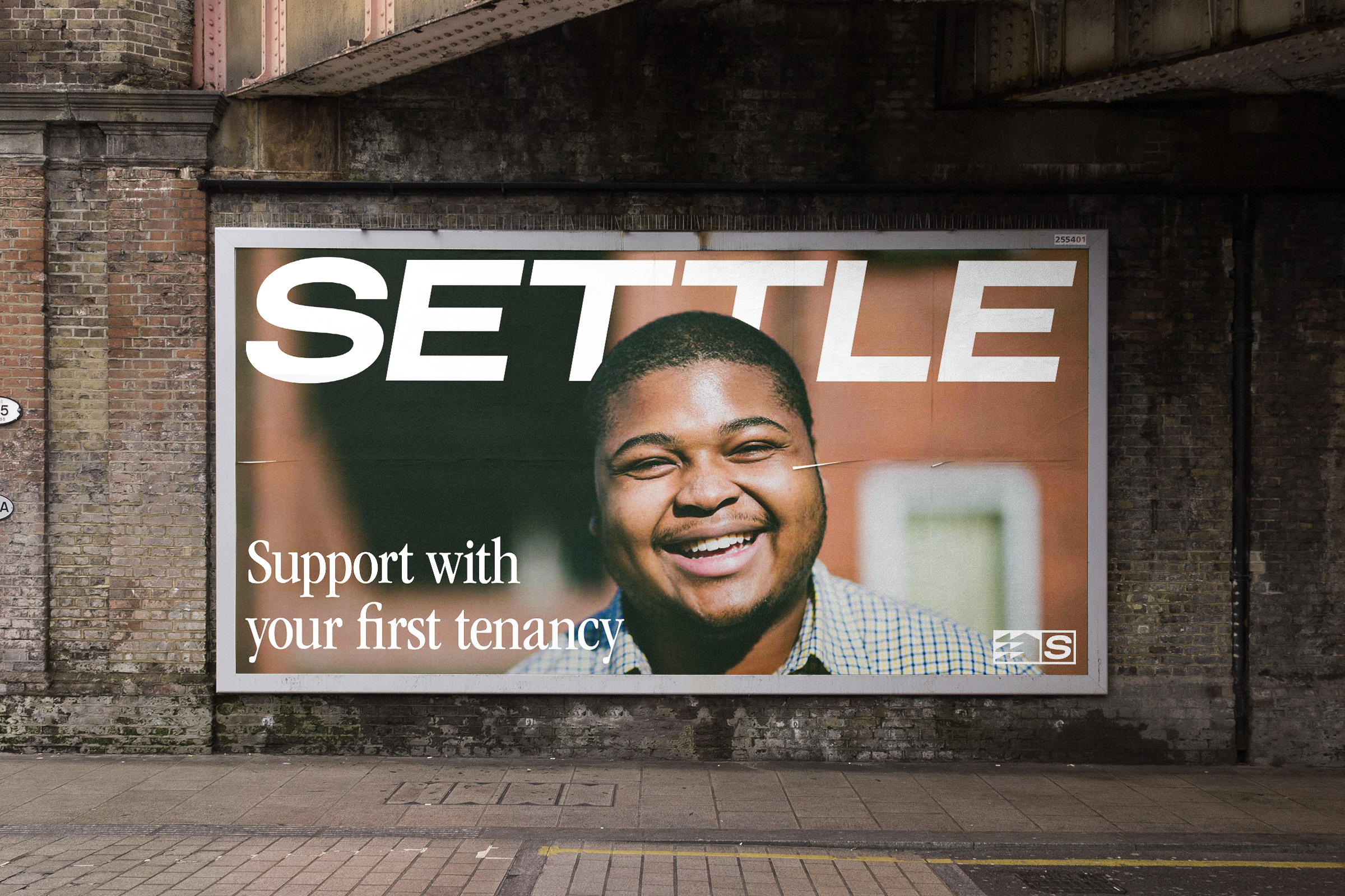
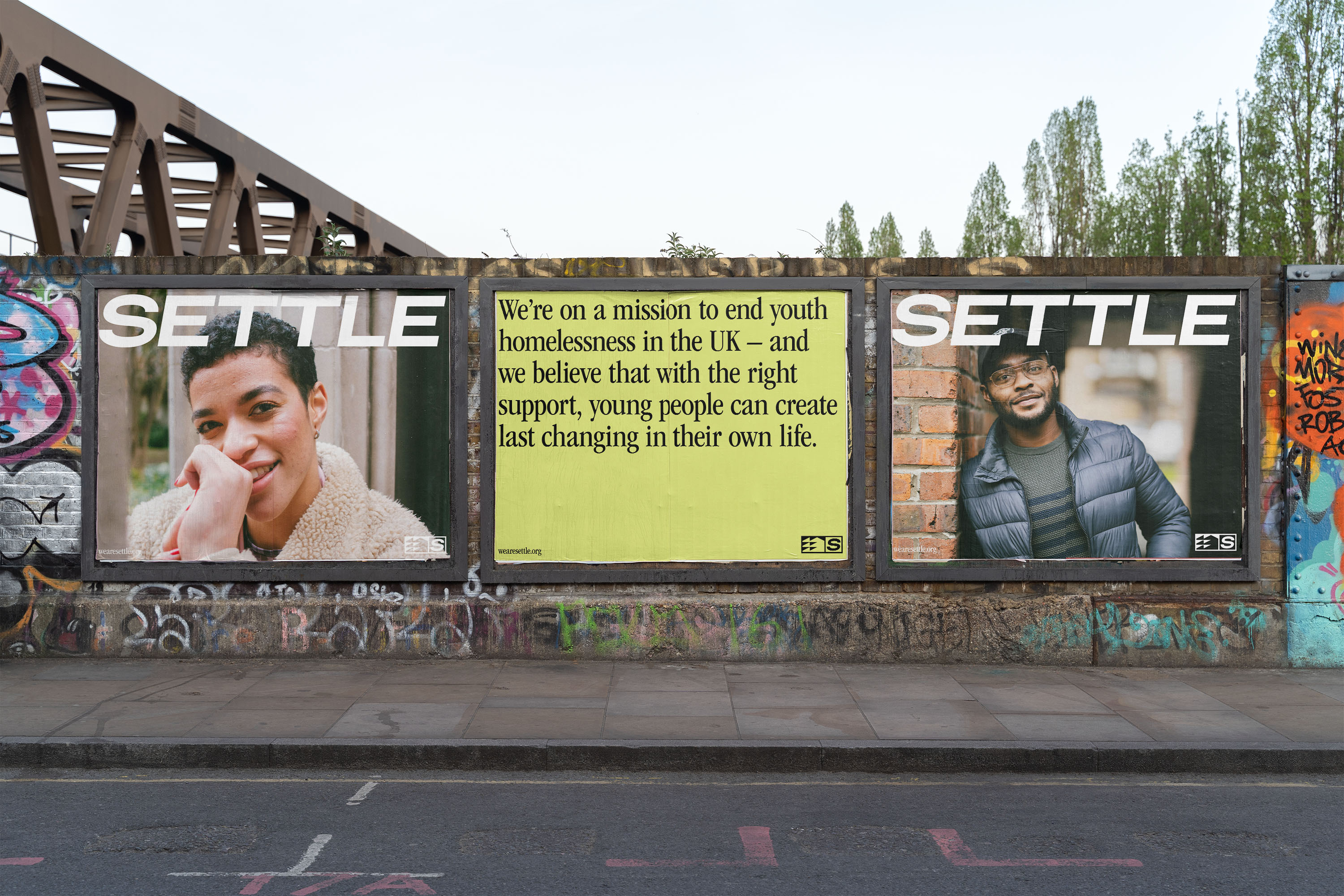

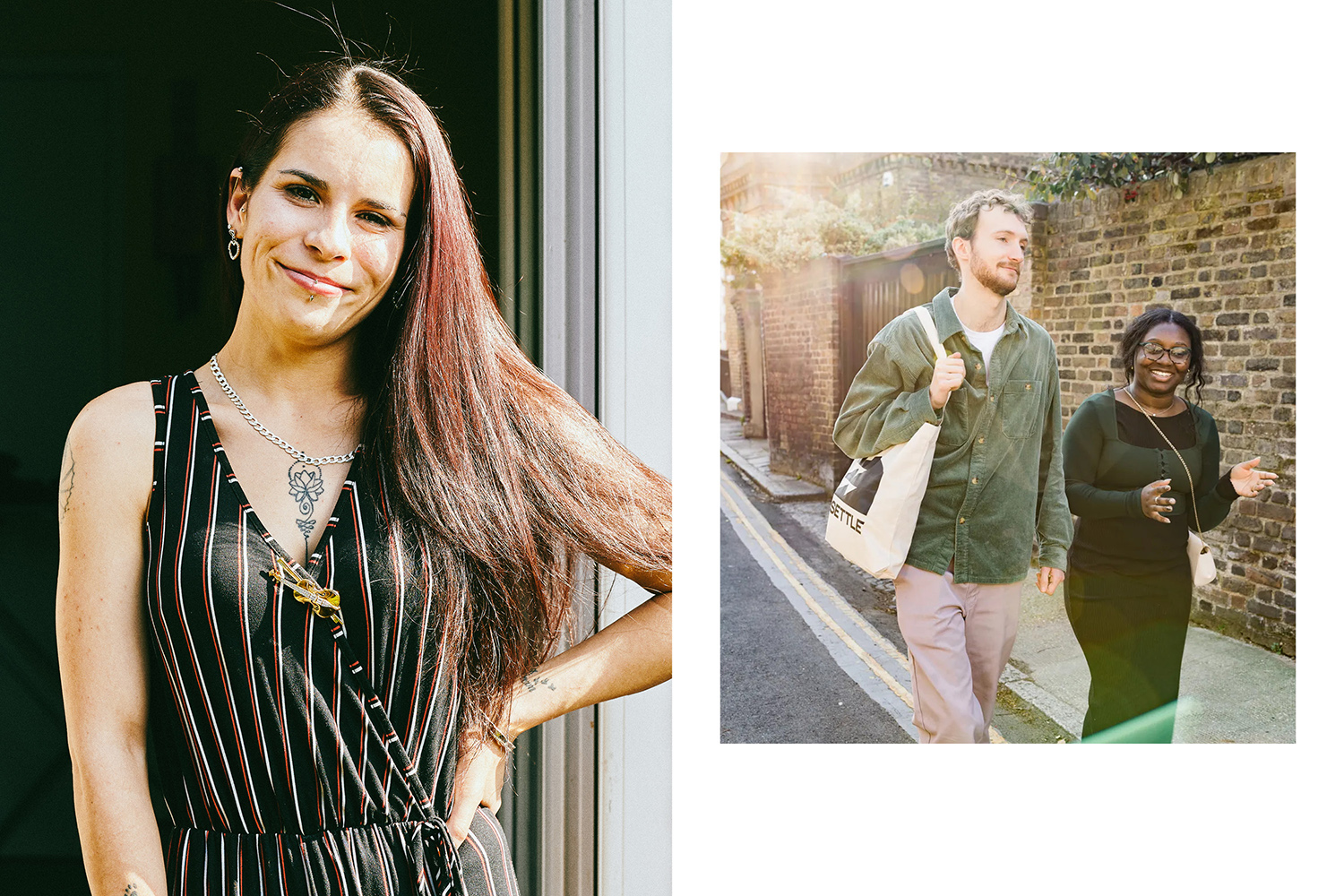

With a focus on authentic storytelling and uplifting messaging, the brand tone of voice is honest, optimistic and empowering.
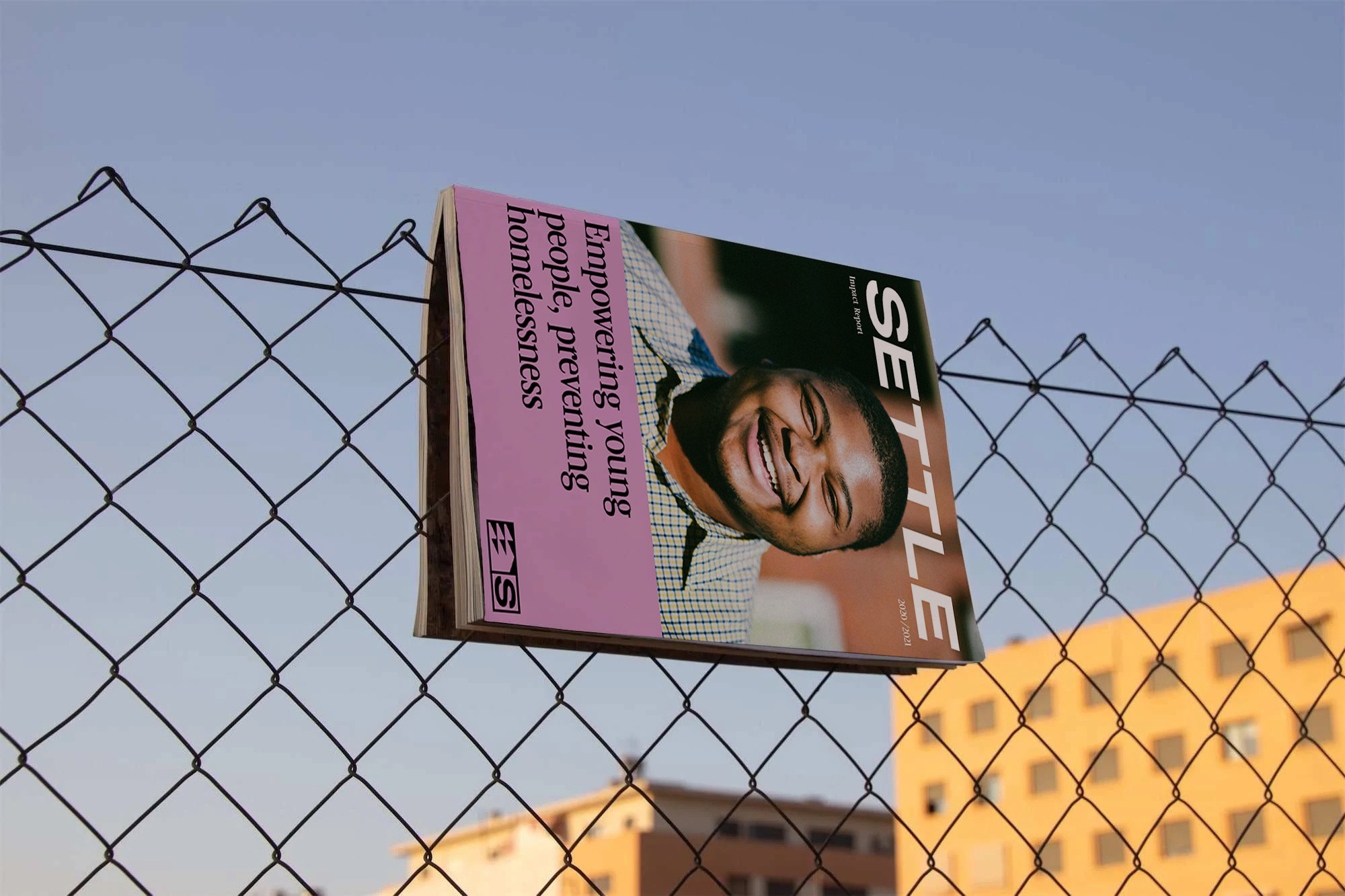
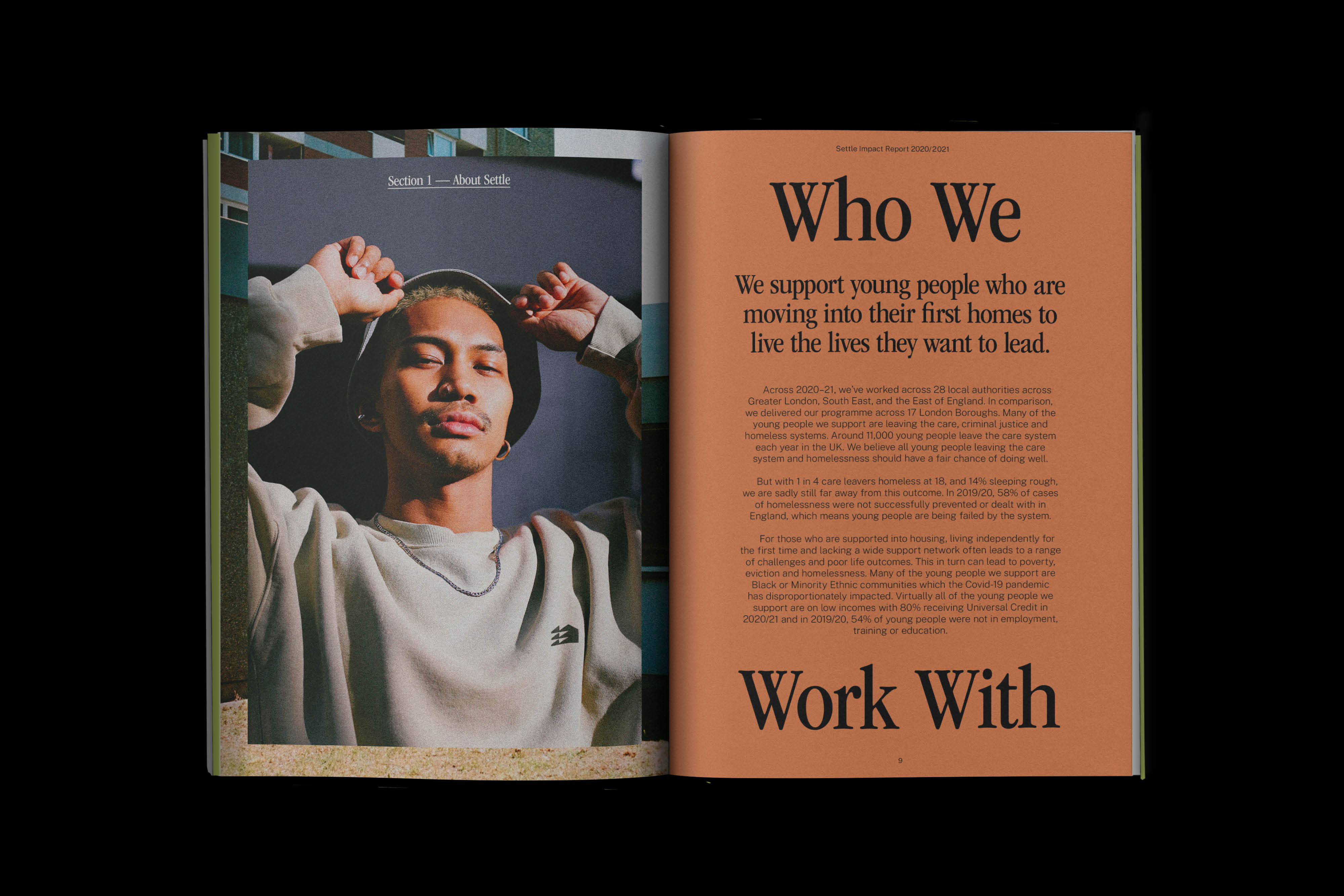
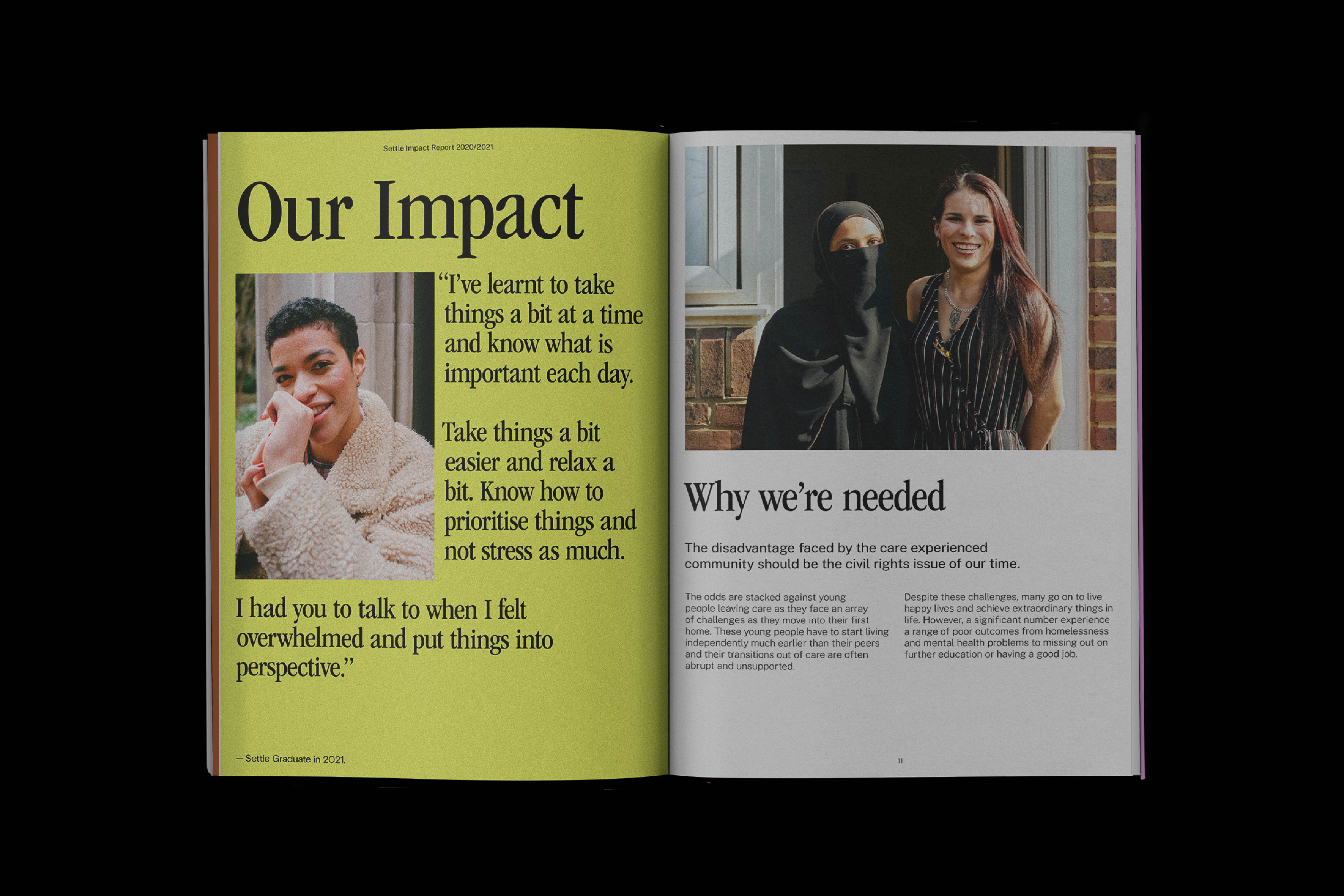
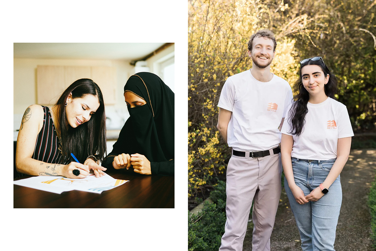
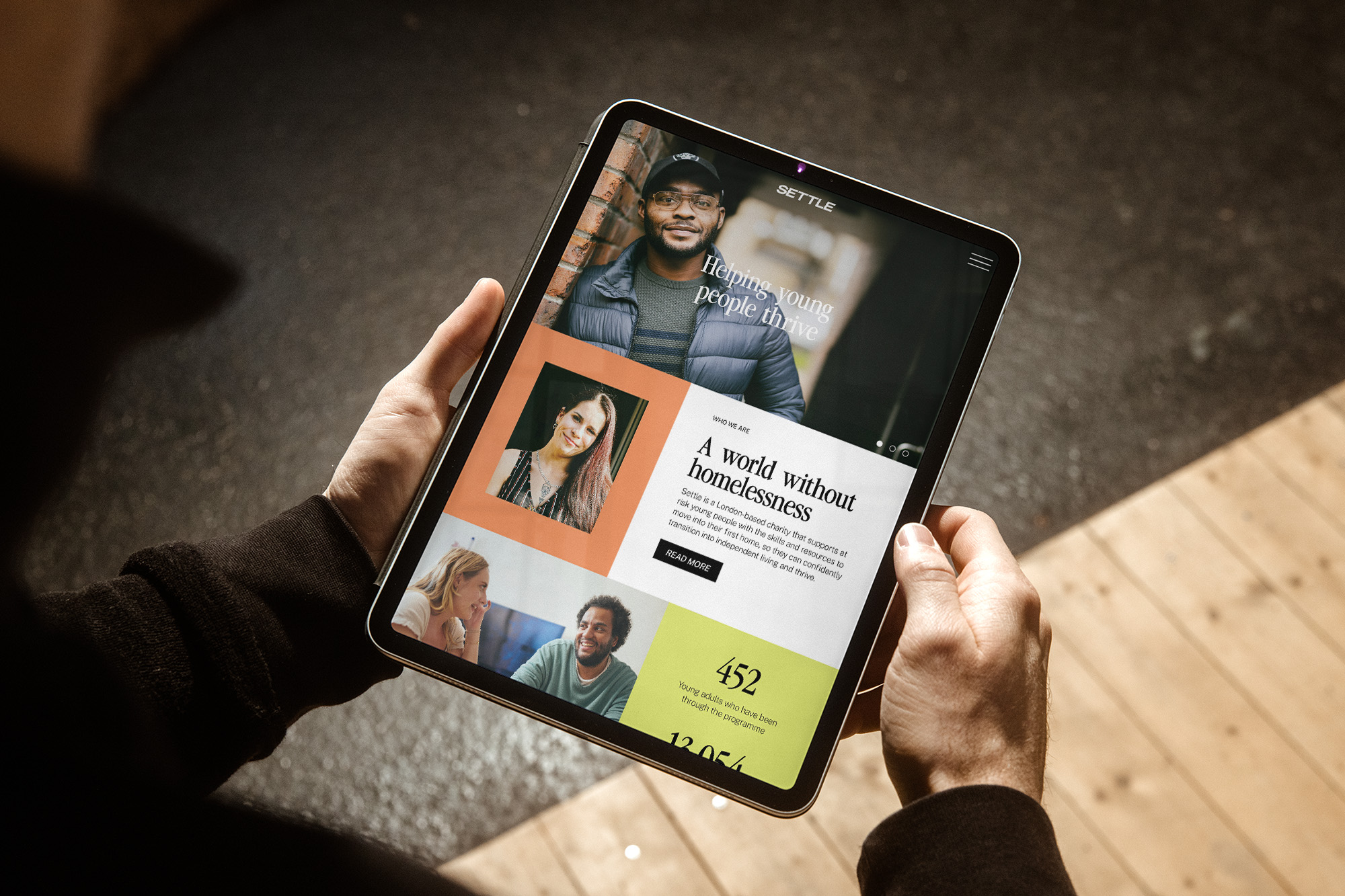
We wanted to create an unconventional charity brand that young people would feel proud to be part of, even after they had graduated from the programme and settled into their new homes.


“Luka's work has been exceptional and exceeded all our expectations. Strategically, they've enabled us to express who we are and differentiate ourselves in a crowded sector. The creative process was ambitious, thorough and collaborative. By reimagining our identity, we feel more confident in communicating our story and strategy to partners and funders. It’s energised our team and given the organisation a new lease of life. Thank you team Luka!”
– Rich Grahame, Chief Executive

